ShopDreamUp AI ArtDreamUp
Deviation Actions


Suggested Deviants


Suggested Collections


![Luto Suite 1.1 [Rainmeter Skin]](https://images-wixmp-ed30a86b8c4ca887773594c2.wixmp.com/i/ee7c62bd-521a-4295-b96e-2a25f177ea51/d5xm5hl-b445d816-7f0f-4337-ab5b-dea4cc4892cb.png/v1/crop/w_184,h_184,x_36,y_0,scl_0.29725363489499,q_70,strp/luto_suite_1_1__rainmeter_skin__by_jlynnxx_d5xm5hl-92s-2x.jpg)
![Luto Suite 1.1 [Rainmeter Skin]](https://images-wixmp-ed30a86b8c4ca887773594c2.wixmp.com/i/ee7c62bd-521a-4295-b96e-2a25f177ea51/d5xm5hl-b445d816-7f0f-4337-ab5b-dea4cc4892cb.png/v1/crop/w_92,h_92,x_18,y_0,scl_0.1486268174475,q_70,strp/luto_suite_1_1__rainmeter_skin__by_jlynnxx_d5xm5hl-92s.jpg)


You Might Like…


Featured in Groups


Comments6
Join the community to add your comment. Already a deviant? Log In
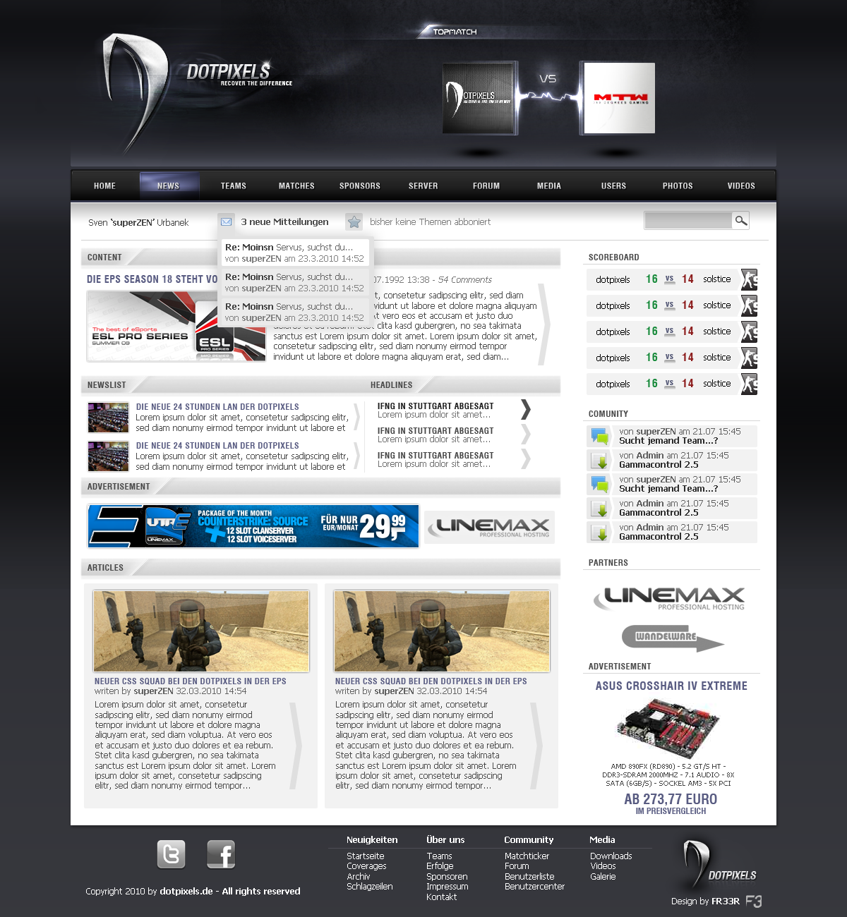
The artwork itself is brilliant. Shiny, well textured, sharp, everything you want in a layout.
There's only two possible changes I could think of.
1. The kerning on the nav buttons is a bit tight, which makes the text look disproportionately small in comparison to the button itself. Maybe increase the letter spacing a tiny bit?
2. You've got a really good illusion of 3D going, from the shadows from the squares on the Top Match section, but the illusion is shattered a bit by the light vertical gradient sitting on top of the navbar. I don't know exactly what to do about it, but those are the two things worth looking into.
Seriously though, if this weren't in the "Critique me" section of the DGUoDA gallery, I wouldn't have noticed a thing. Marvelous work, I'm off to look at the rest of your gallery now!